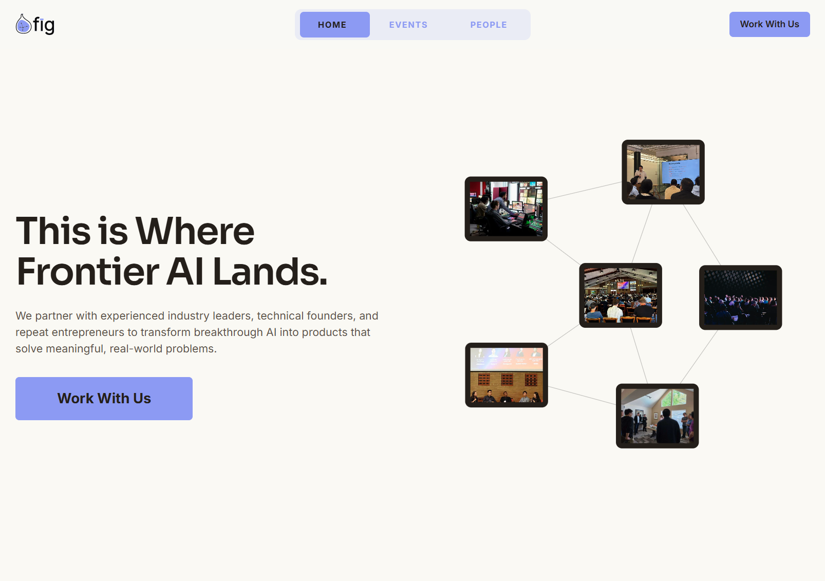
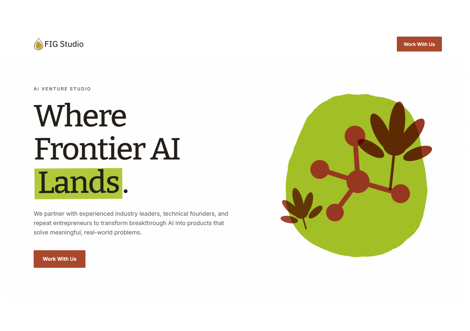
FIG Studio: a redesign of FIG Studio’s website, focused on clarifying its information hierarchy, consolidating its content, and preparing the site for future pages.
The site gave most sections similar visual weight, so its clearest ideas competed with restated and overlapping content.
Reworked the hierarchy, content, and visual system, and explored navigation and motion for future growth.
A clearer, more consistent site with a structure that can support future pages.
Redesigning FIG Studio’s website
FIG Studio asked me to redesign their site with clearer hierarchy, tighter content, a stronger visual system featuring their brand color, and a navigation system ready for future pages.
I worked closely with another designer, and checked in regularly with FIG's founder to keep direction aligned with her priorities.
Establishing a consistent visual system
Most sections carried similar visual weight, so I started with rules: clearer standards for type, spacing, color, surfaces, buttons, and cards. The brand color became part of the site’s hierarchy instead of an isolated accent.
Making the important ideas easier to find
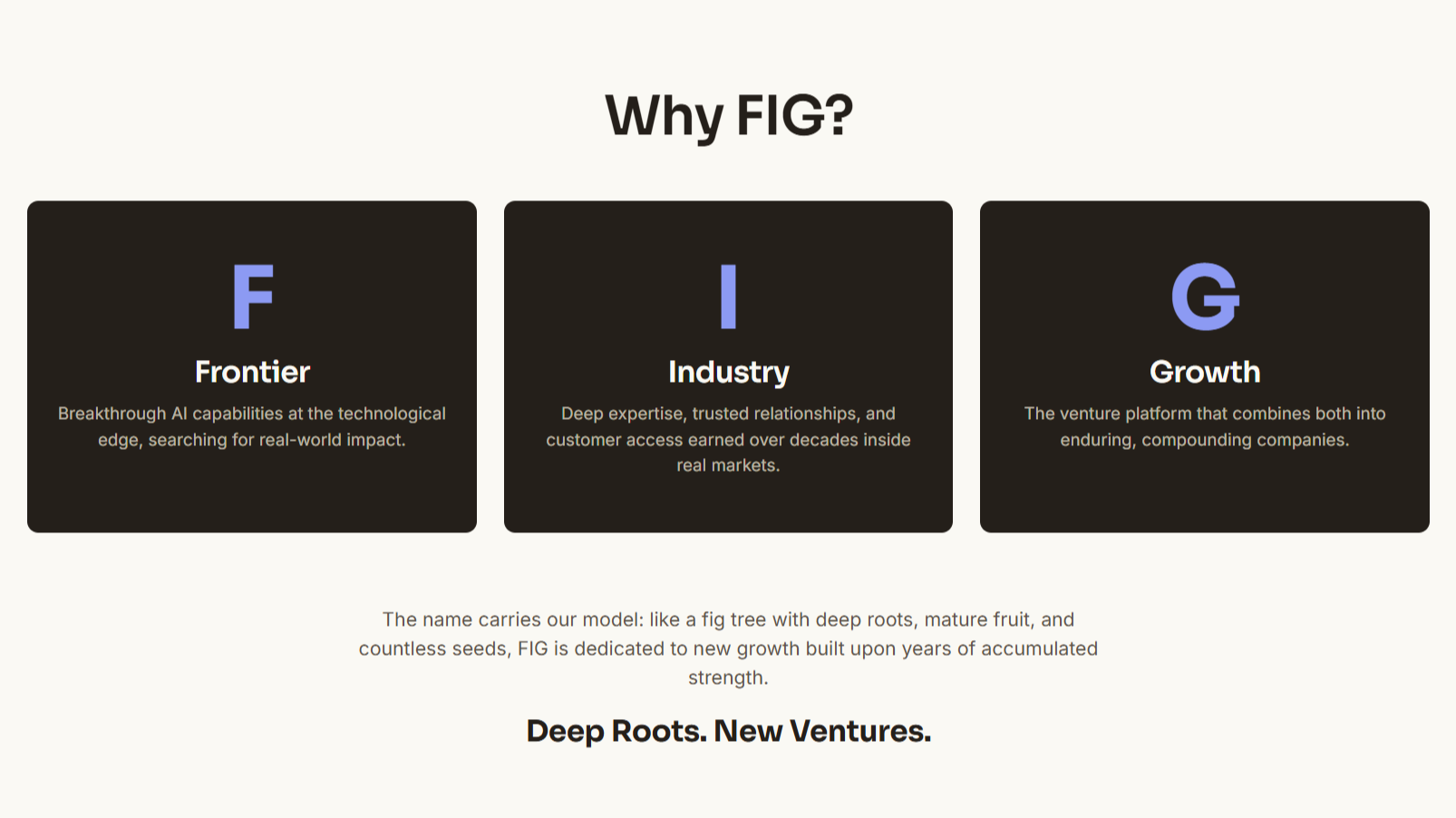
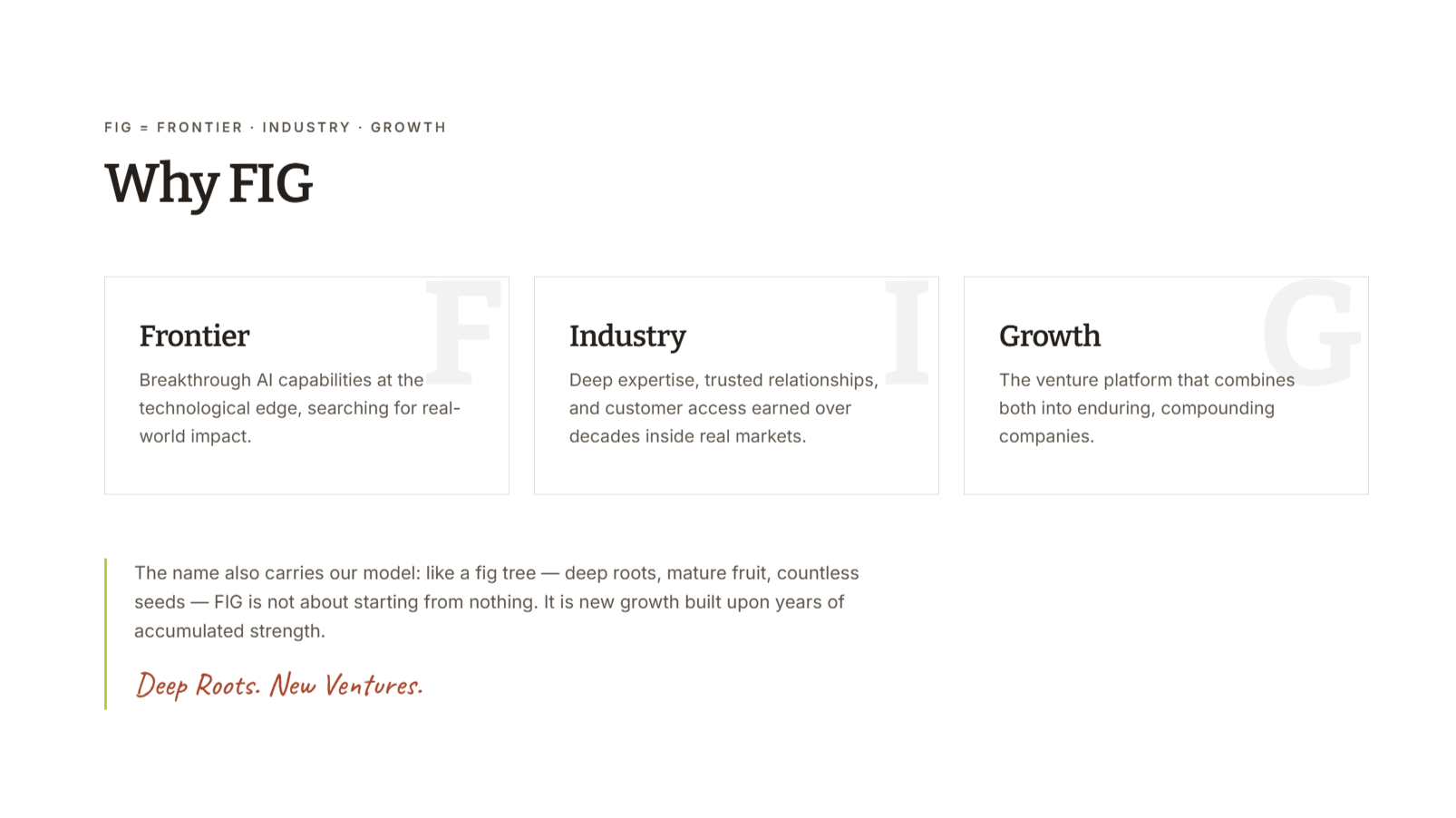
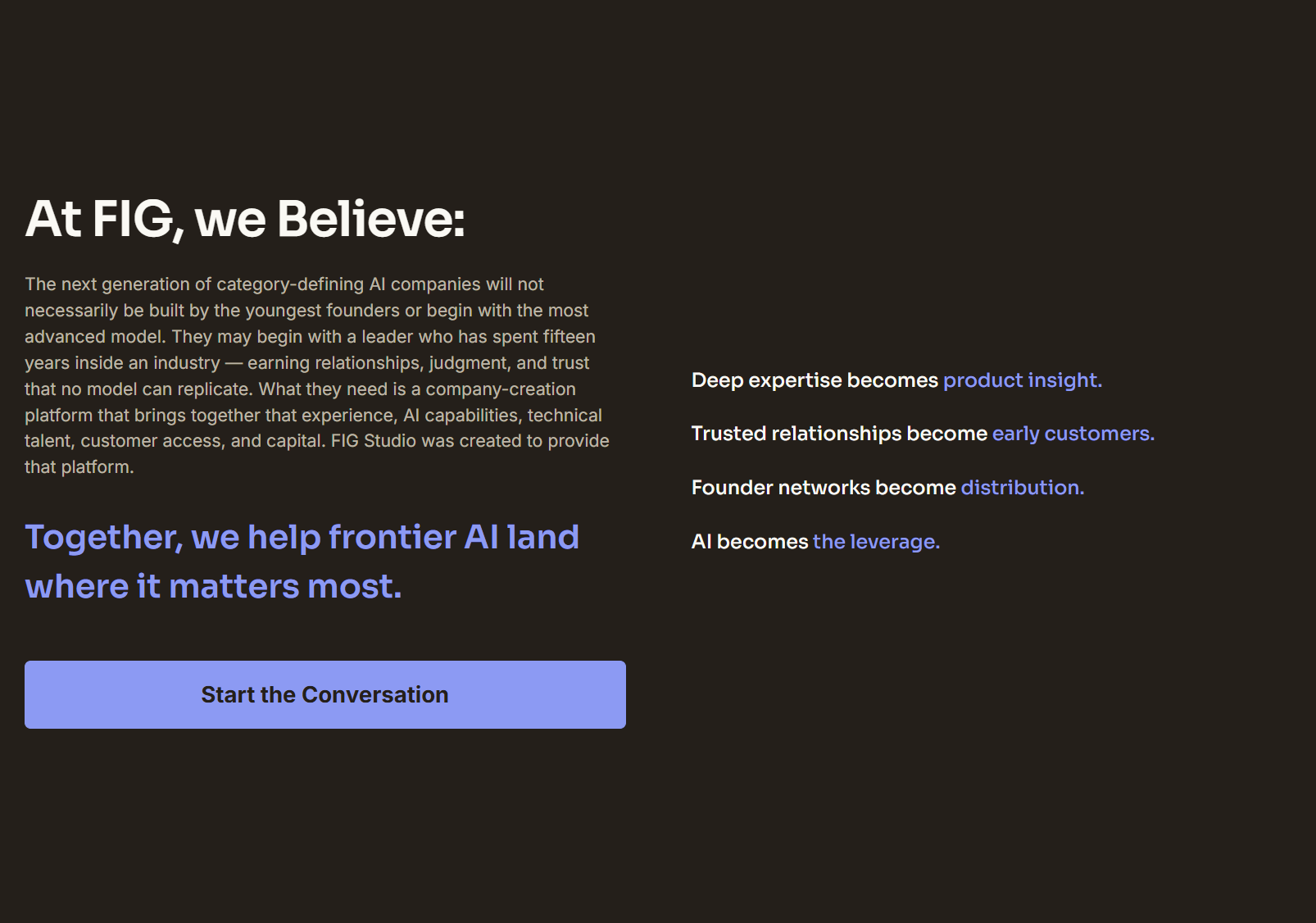
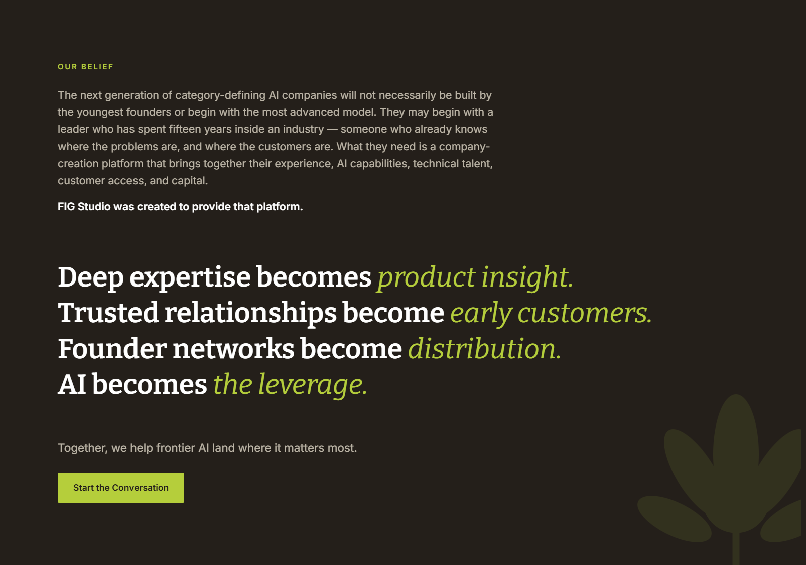
The Belief section shows those rules at work. It had five pieces (thesis, restated thesis, four statements, a final statement, a call to action) equally competing for attention.
I gave it an order: thesis and statements grouped into two columns, the final statement elevated, and the CTA given more weight.
Designing navigation for future pages
The original navigation only supported the landing page. I introduced Home, Events, and People, so the site can grow to support future gatherings and future founders or collaborators.
Extending the brand through motion
I explored a looping animation connecting FIG’s network, its mark, and the companies behind it, designed to loop continuously.
This was an exploration and wasn’t implemented on the live site.
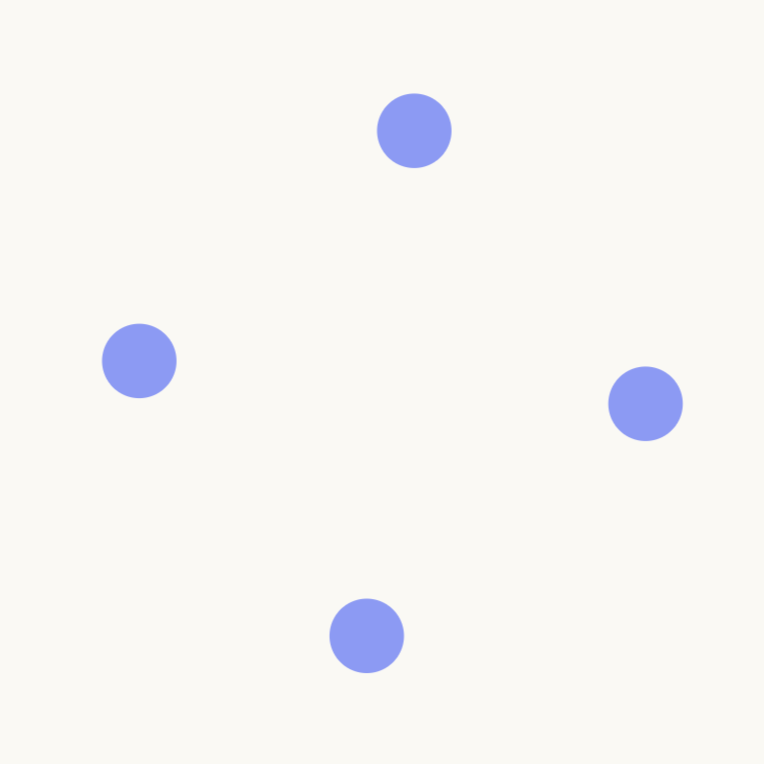
The rotating circle creates continuous movement, giving the graphic a natural loop and drawing attention without relying on a static composition.

The logo illustration emerges from the motion, giving the brand a recognizable focal point. The illustration style was developed to align with the visual language established for FIG.
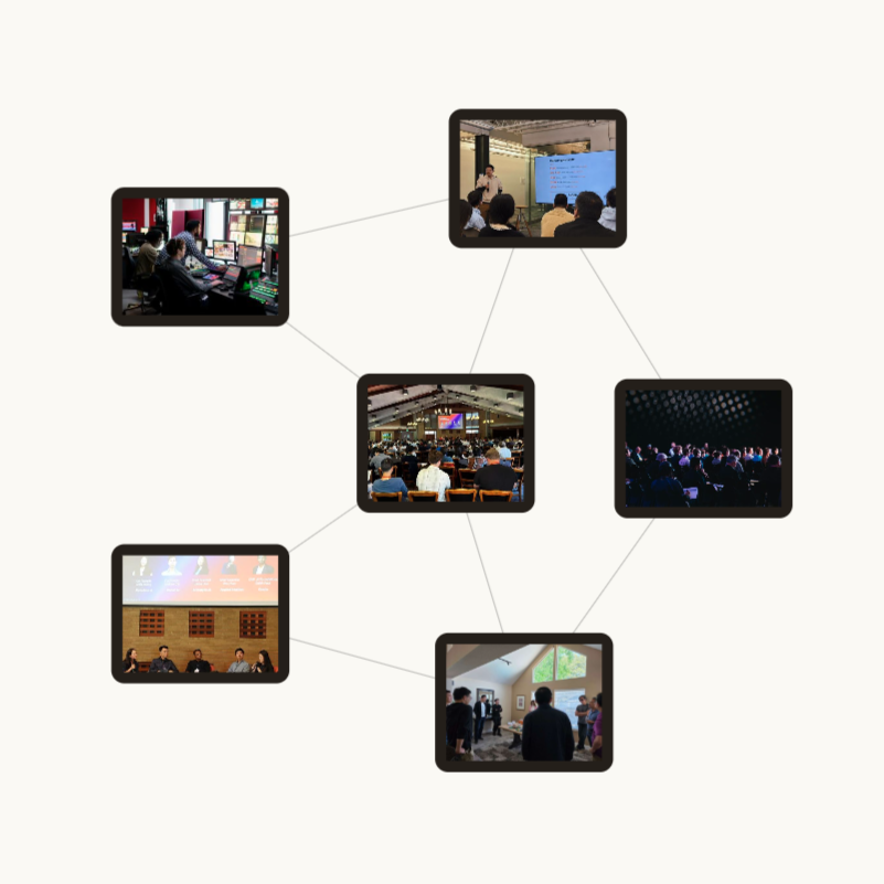
The illustration transitions into a network of real photos, connecting the brand to its community and providing a visual cue of social proof and credibility.
Final submitted design
This is the design I submitted. Some elements were revised before the site went live. View the submitted page here
What I learned
A brief gives direction, but a client’s real priorities become clearest through feedback, sometimes after a lot of work is already done.
For example, the motion concept was one of the more developed parts of the project, but it ultimately didn’t make it to the live site. What ships isn’t always what the designer invests the most time in, and that is perfectly normal.