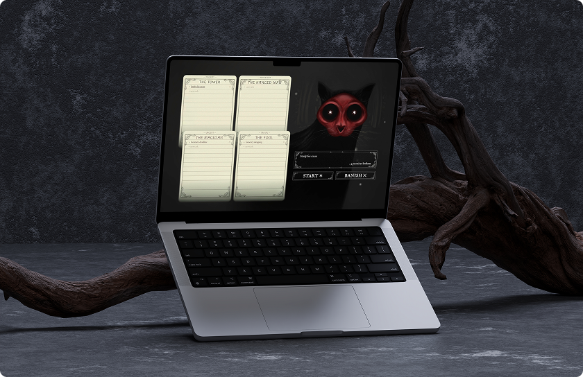
Skullcat’s Omen: A gamified, horror-themed task manager for people with executive dysfunction.
Long task lists cause choice paralysis for people with executive dysfunction, so nothing gets started.
Designed a task manager that removes the moment of choosing via randomization and a game-like feedback loop.
Working prototype, tested and iterated on visual style, pacing, and interaction feedback.
Making task selection easier to start
Skullcat’s Omen is a task-management tool for people who struggle with choice paralysis and executive dysfunction.
The app reduces task selection to two inputs: How urgent is it? How important is it?
Once tasks are categorized, the user presses one button. Skullcat prophesizes, the board goes dark, and the app chooses an omen.
The interaction turns “What should I do?” into a smaller decision.
How can we get anything done when starting seems impossible?
Typical task workflows assume that once someone has a list, they can choose an item, prioritize it, and begin. For people with executive dysfunction, each step can become another point of friction.
I focused on the moment where choosing the next task becomes difficult.

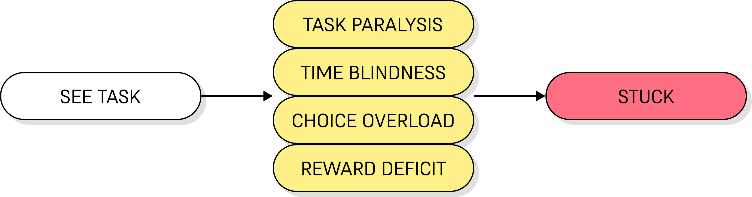
Meet Devon: he knows what to do, but can’t make himself start
Devon is a composite of the executive-dysfunction pain points I designed Skullcat’s Omen around, built from research into ADHD and task paralysis.
Devon
Freelance Designer, ADHD
Devon’s list has thirty open items and no sense of which one is due when, so he defaults to whichever task is making the most noise instead of the one that actually matters, or freezes and picks none of them at all.
How might we help people with executive dysfunction skip the moment of choosing entirely and just start?
The gap between task apps and choice paralysis
I researched existing products aimed at ADHD and executive-function challenges, looking at reward systems, gamification, visual task grids, and priority-based organization.
These approaches helped with motivation and organization, but few addressed the specific problem of choosing where to start.
Habitica
Turns tasks into an RPG with XP, gold, and an avatar
✅ Strengths: Deep reward system, party accountability, free plan.
❌ Weaknesses: Missed dailies cost avatar health, cluttered UI, no urgency sorting.
Tiimo
Visual timeline planner built for time blindness
✅ Strengths: Neurodivergent-first design, gentle nudges, widgets.
❌ Weaknesses: Day-planning only, no gamification, no help choosing what’s next.
Finch
Self-care habit app tied to a pet you raise
✅ Strengths: Gentle, no punishment for missed days, strong free tier.
❌ Weaknesses: Built for habits, not task lists. No priority or urgency framework.
TickTick
General task manager with a built-in Eisenhower view
✅ Strengths: Native quadrant view, Pomodoro built in, free tier
❌ Weaknesses: Sorting is manual and ongoing. No reward loop, no help starting.
Turning executive-function challenges into game mechanics
Each executive-function symptom maps to a specific game mechanic rather than a generic productivity feature.
🔒 Task Paralysis
Wanting to start and being able to are different things. People may be unable to start or finish tasks despite having the intention and desire to do so.
🎮 Gamification
The UI uses game-like feedback to make interacting with the task list more engaging.
🕔 Time Blindness
The brain can struggle to perceive, track, or estimate the passage of time. Deadlines are perceived as “not now” until it’s too late.
💀 Dread System
When the task list remains stagnant, the UI darkens and desaturates, adding pressure to return to unfinished tasks.
🧠 Choice Overload
A full task list forces users to repeatedly decide what matters most, making it harder to start.
🐱 Skullcat’s Pick
One click draws a random weighted task from the pool. Deciding what’s next stops being a user decision.
🏆 Reward Deficit
Routine tasks don’t generate enough dopamine to trigger action. The brain needs novelty, urgency, or interest to switch into action mode.
⚡ Interactivity
Sound and motion give each interaction immediate feedback.
🌩 Decision Lag
A complex interface with nested menus and multiple screens adds friction before a decision can even be made, and every extra tap raises the odds of giving up entirely.
✨ Simple UI
Keeping the core workflow on one screen reduces navigation and visual distraction.
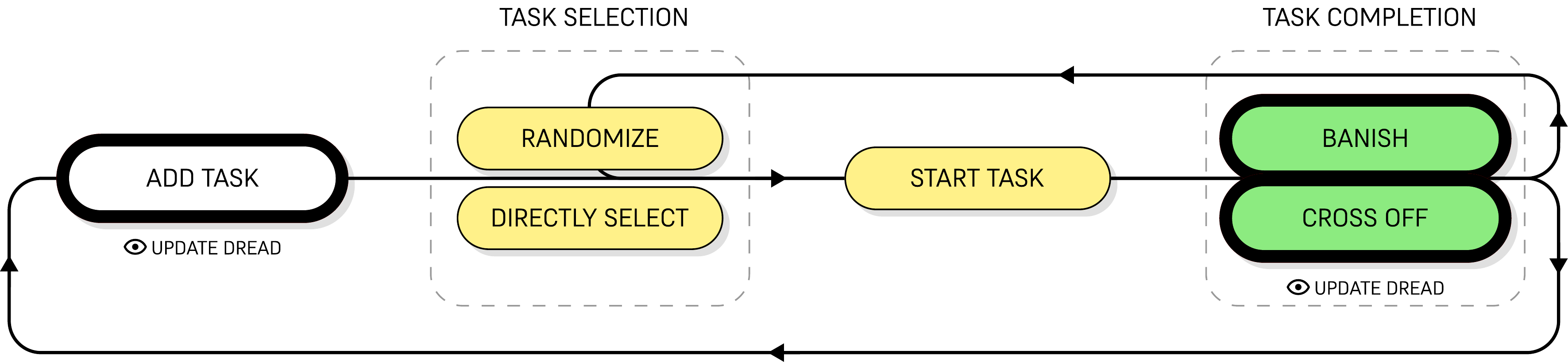
One loop: add, pick, complete, repeat
Add a task, then either let Skullcat pick one at random or choose it directly, complete it, then either banish it with the randomizer’s flourish or cross it off yourself, looping back to adding the next one.
Why horror: making task selection a ritual
Horror gives the randomization process a sense of anticipation and ritual, so task selection feels like a small game rather than a checklist.
The visual direction draws from horror games such as Fran Bow and Fear & Hunger, alongside gothic and occult imagery: tarot, skulls, cats, and ritualistic interfaces. Skullcat became the centerpiece of the ritual.
Autism researcher Greg Siegle notes that haunted houses and horror media direct attention through constant, forceful stimuli and let people mask less, so big reactions that are usually suppressed elsewhere become socially acceptable.
Axios · Greg Siegle, University of PittsburghAutistic writer Ethan Lyon describes horror as offering a “contained environment” for the sensory overload and dread that already shape daily autistic experience, a controlled dose of a feeling that’s otherwise constant.
Evolution of Horror · Ethan Lyon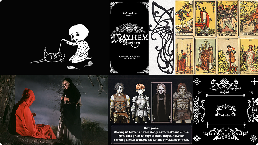
When grotesque-cute missed the mark
My first draft leaned heavily into a cute, cartoon-like interpretation of Skullcat. The single-screen interface gave the task matrix most of the space, using large vector blocks and illustrations created in Figma and Affinity.
The interaction worked, but the visual language felt too cutesy for the horror-adjacent atmosphere I wanted. This was my own judgment, not a test result.
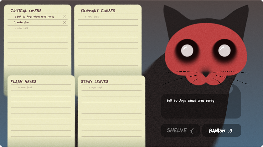
What I Liked
✅ Randomizer layout seems intuitive
✅ Task list layout seems intuitive
✅ Skullcat’s position and size looks pretty proportional
What I Didn’t
❌ Too many bright colors
❌ Randomizer controls seem too cartoony
❌ Comico font is also too cartoony
❌ Skullcat illustration looks a bit too flat
Pivoting from vectors to gothic detail
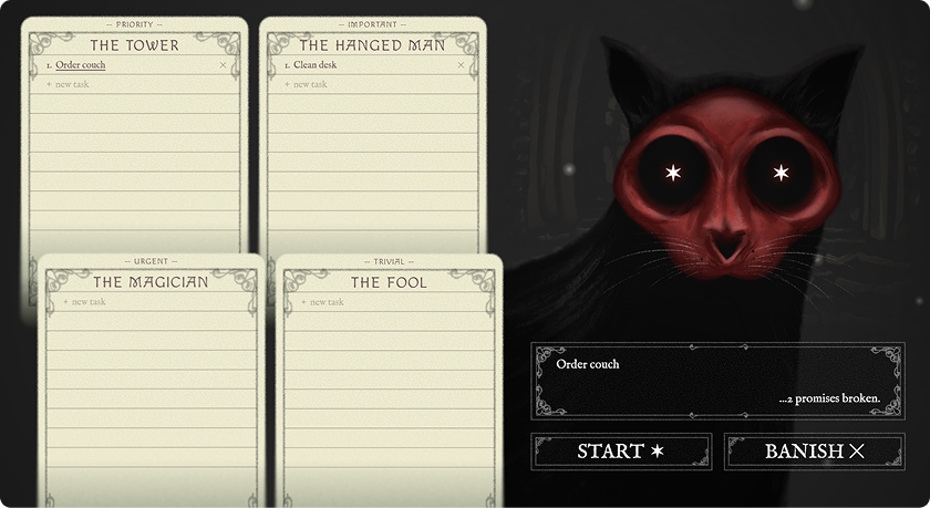
To fix the cutesy feel, I replaced the vector-heavy treatment with hand-drawn illustrations and a gothic aesthetic, extending ornamental rectangular components across the randomizer and task cards. Typography shifted to Macondo for titles and buttons, and IM Fell English for task lists.
Each task category maps to a Major Arcana card by theme:
🗼 Priority > The Tower
🙃 Important > The Hanged Man
🪄 Urgent > The Magician
🃏 Trivial > The Fool
Once the visual direction was locked, I built the full app in Claude: task logic, randomization, the dread system, and live-synthesized sound.
Motion and sound became part of the ritual, letting the randomizer build anticipation before each pick.
Motion
🌀 Selection whip
Task cards rock during a reading, then snap past center into an overshoot wobble before settling.
🎯 Landing wobble
Picking a task directly, without a reading, still gives it a small kick and the same settle sequence, just gentler, so a direct click has a little life too.
🧙 Passive drift
Cards sway on their own in an occasional wind cycle, the cat breathes with a subtle scale pulse, and small sprites drift upward in the background.
Sound
🔮 Divination drone
A cluster of closely-detuned high tones plus a swirling noise layer, both fed through a long reverb, playing continuously while the board darkens for a reading.
🔨 Selection clang
A metallic hammer-on-anvil hit: a low thump, dissonant ringing partials, a sharp crack, and a bright reverb tail, the instant a task locks in.
💀 Hollow knell
A detuned bell that droops flat, the sound of a rite that can’t proceed, played when banish or divine is pressed with nothing to act on.
⌨️ Adding tasks
Each keystroke gets a sharp typewriter clack (duller for backspace), and pressing Enter to commit the task swaps in a small bell ding instead.
🌬️ Ambient noise
A quiet, continuously-drifting wind and air bed runs underneath everything, with occasional soft high “fairy” glints and gust whooshes layered on top at random intervals.
Testing: too scary, and too slow
Testing with 10 volunteers, alongside my own use, showed the new look went a bit too far: 30% found it frightening and intimidating. Performance was the other problem. Some effects caused lag during task selection, so I removed or simplified them until it felt responsive.
💀 Too Scary
30% of testers found the visual style frightening and intimidating, enough that it could keep people from using the tool regularly.
⚡ Occasional Lag
40% of testers found that the task selection process can lag and/or skip frames, especially when pressing ‘stop.’ This may be due to the sheer amount of effects happening on the screen in one instant.
What I learned
A strong visual concept still needs to serve the product problem.
For Skullcat’s Omen, horror shapes the interaction itself: categorization becomes ritual, randomization becomes anticipation, and choosing a task becomes a small moment of play.
But I focused so much on presentation that, for some people, it stopped being a tool they wanted to use. A task manager only helps if people want to come back to it.