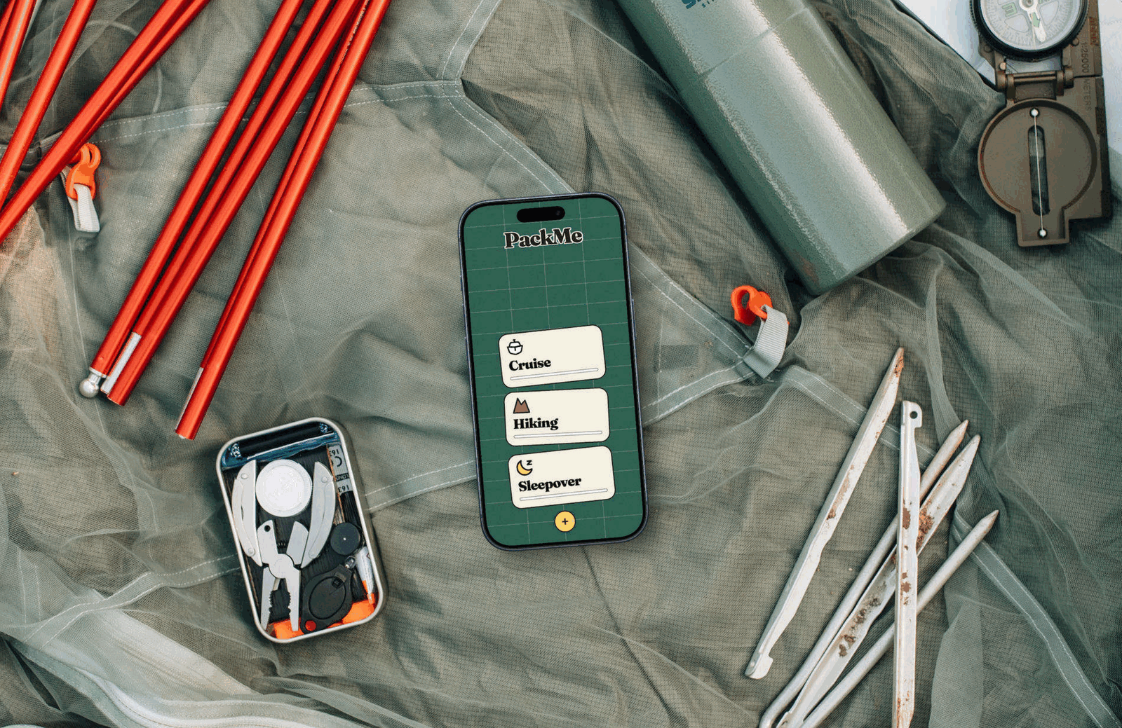
Why do we still forget the same things, every single trip?
According to Radical Storage, 42% of people pack by checking off a packing list, yet 51% end up forgetting something anyway. It turns out, a checklist doesn’t always stop you from forgetting your socks, your charger, or even your passport.

PackMe doesn’t ask you to remember anything, it only asks you to take action or intentionally defer. Instead of a wall of text your eyes can glide past, each item gets one card, and only one choice: pack it now or pack it later. Unlike a checkbox you never revisit, a skipped item drops back into the deck until you actually pack it.

Problems & Solutions
📋 List Blindness
Long checklists get skimmed. Familiar items you use daily, like a charger or toothbrush, are the easiest to assume you’ve got, and the easiest to miss.
📱 Swipe to Decide
You can’t skim past a card that’s the only thing on screen. One item at a time forces the eye to actually land on it instead of gliding over a block of text.
🧠 Choice Overload
A full packing list dumped on one screen, with up to 30, 40+ items, is overwhelming to look at, making it easy to get tired or to put it off.
📦 Categorization
Items are split into General, Clothes, Electronics, Trip-Specific, and Hygiene decks, so you’re never facing more than one focused stack at a time.
📊 Progress Bars
Progress shows at both the category level (card) and item level (inside the sorter), so momentum is always visible.
⚫ No Middle Ground
Most checklists only have two states: checked or unchecked. There’s no way to say “not sure yet, come back to this.”
↩ Skip = Defer
The skip mechanic drops the item back into the stack instead of discarding it. Uncertainty doesn’t mean the item disappears.
Market Research
After researching similar apps in the market I found that across the board, the default is optimizing for better lists (smarter suggestions, weather data, sharing) rather than better decisions. PackMe approaches this from a different view by changing the interaction model entirely.
PackPoint
Weather-and-activity-based packing list generator
✅ Strengths: Weather-and destination-based suggestions; free and simple
❌ Weaknesses: Activity-based suggestions are generic and the interface feels dated; still a static list at heart
Packr
Multi-trip, multi-person packing list organizer
✅ Strengths: Good for multi-destination trips; family/group list support
❌ Weaknesses: Can feel visually cluttered on smaller screens
TripIt
Trip-tracking app with a built-in packing list feature
✅ Strengths: Bundled with itinerary/flight tracking, so it’s already part of many travelers’ workflow
❌ Weaknesses: Packing list is a secondary feature, not built around the packing decision itself
Notes App
The default option: a blank list with no built-in system.
✅ Strengths: Zero friction to start and fully customizable
❌ Weaknesses: No structure, no reminders, and the format itself is part of why items get missed
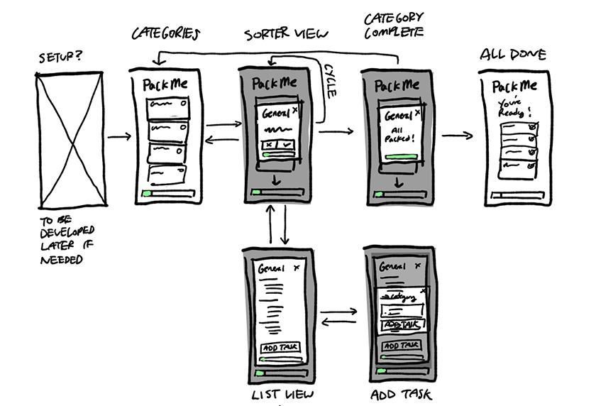
Low-fidelity Screen Flow
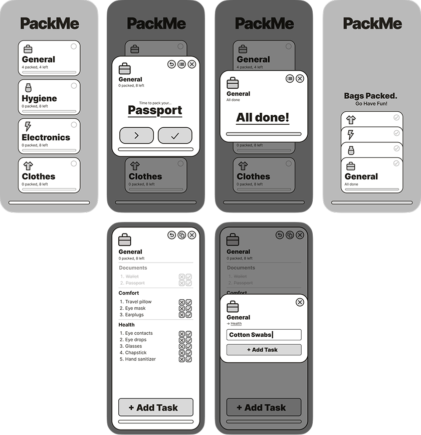
Mid-fidelity Wireframe
Visual Identity
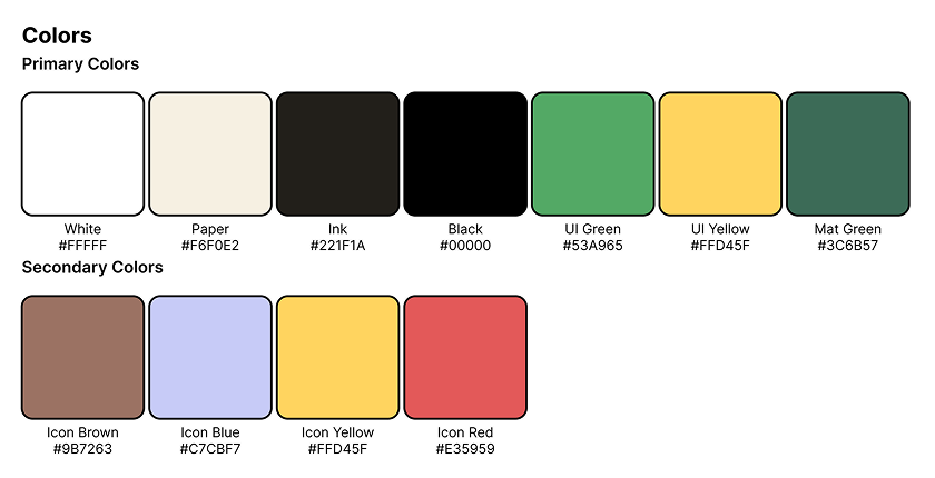
The app takes inspiration from real-world tools and tactility, using cutting mats and index cards to represent packing digitally as a physical action. An index card you flip or set aside reads as something you do with your hands, which mirrors the decision I am actually asking the user to make (pack this or don’t), rather than the more abstract feeling of checking a digital box.
I chose to use a simple, tactile style instead of a typical modern sleekness, with thick black outlines, chunky rounded corners, and pill-shaped buttons, reading like a printed game piece or a sticker rather than a typical app screen. This supports the feeling of making a physical decision while keeping UI ornamentation at a minimum.
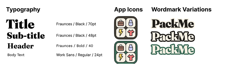
For typography, I paired Fraunces, a display serif with soft, high-contrast, with Work Sans, a clean grotesque built for legibility. At the bold weights used in the PackMe wordmark and headlines, Fraunces reads chunky and tactile, while Work Sans in the body text and item labels appears neutral, which keeps long item names and progress counters easy to scan. This contrast results in a feeling of approachability.
High-fidelity Screens
User Testing
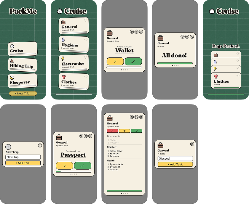
I ran a round of usability testing with 5 participants, walking through the packing flow. Two out of five didn’t immediately understand what the defer button did, and a handful of smaller questions came up around navigation and information density. Below is what came up and what changed in response.
2 of 5 testers weren’t sure what the defer icon meant at a glance.
Replaced it with a clearer double chevron icon, facing left.
Testers wanted more control over a task than just a title when creating one.
Added icon and image customization options for new tasks.
List actions like task adding, editing, or reordering took extra taps to reach.
Compressed list functions directly into each row and into the list view itself.
The “Add Trip” button pulled too much attention and distracted from the rest of the screen.
Redesigned and repositioned it to sit less prominently.
Once inside a trip’s sorter view, testers had no way to back out.
Added a back button to trip sorters.
Inside a trip, the title was oversized and pushed content down.
Shrunk the title text and added a back button.
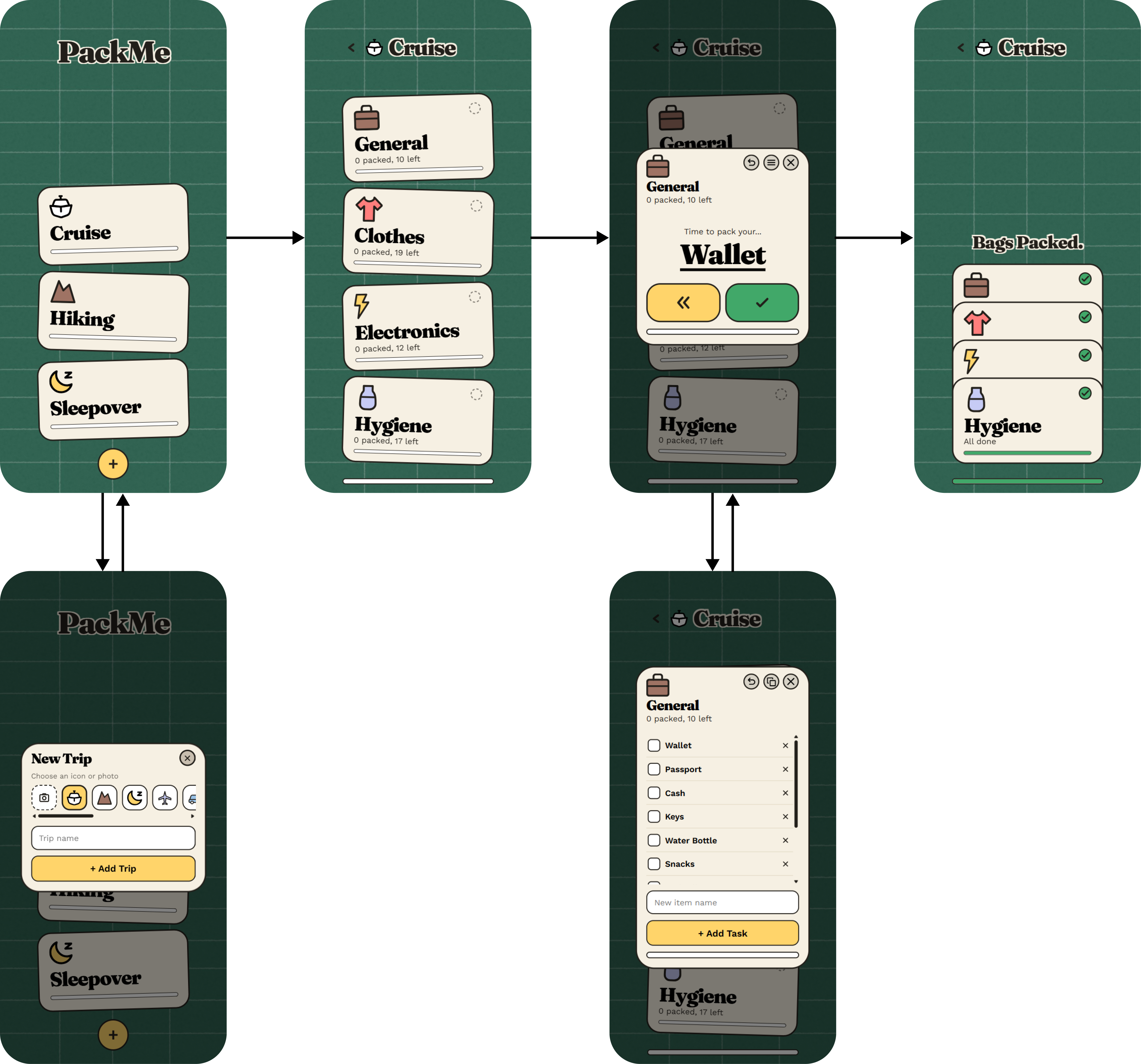
Final Screens
Motion, Sound & Prototyping
After addressing these issues, I turned the revised designs into a fully functioning prototype using Claude Code paired with Figma’s MCP integration, translating the high-fidelity screens directly into working front-end code rather than a click-through mockup. This let me test the updated defer flow, task customization, and navigation changes the way a real user actually would, and gave me a real surface to layer in the motion and sound choices below. Sound effects sourced from Balatro’s sound library via The Spriters Resource. Motion and sound work together to make every decision feel immediate, leaning into the same tactile, physical quality that runs through the rest of the design.
Motion
🃏 Card interactions
Opening a category or dragging a card releases it into a pack or skip, instead of snapping back to center.
📦 Completion fold
Finishing a category or trip untilts the cards and settles them into a neat stack.
🃞 Unstack
Tapping a folded stack fans the cards back open.
Sound
👆 Default tap
Going back, packing, skipping, undoing, and deleting all share one plain tap, so nothing routine competes for attention.
🃏 Card interactions
Opening a category or dragging a card past the threshold plays the same card-fan sound, which sounds like a paper rustle.
🎉 Milestones
Starting a new trip, finishing a category, and finishing a trip each get their own distinct chime, with finishing a trip getting the grandest of the three.