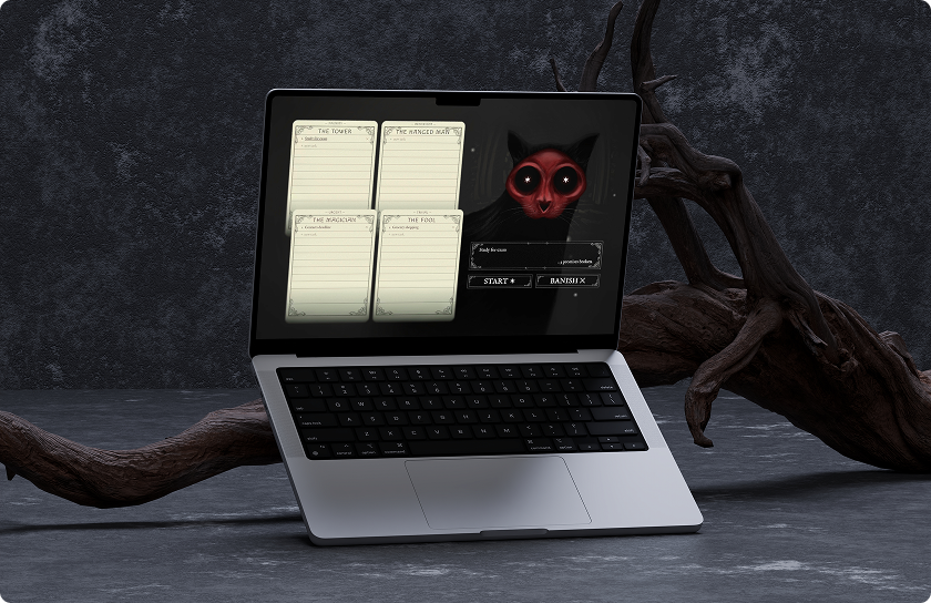
How can we get anything done when starting seems impossible?
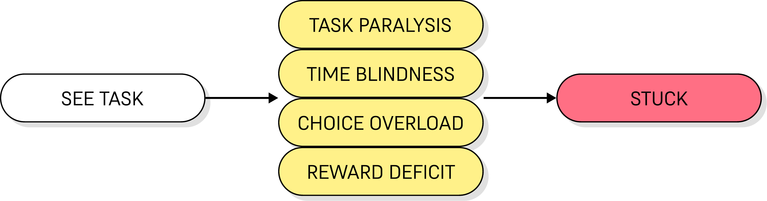
For most people, the process of completing a task looks like this:

However, for those who struggle with executive dysfunction (ADHD, ASD, and others), there are many hurdles that can prevent progress.
Problems & Solutions
🔒 Task Paralysis
Wanting to start and being able to are different things. People may be unable to start or finish tasks despite having the intention and desire to do so.
🎮 Gamification
The UI and atmosphere are designed to simulate a video game, making interaction more fun and desirable than with a traditional task manager.
🕔 Time Blindness
The brain can struggle to perceive, track, or estimate the passage of time. Deadlines are perceived as “not now” until it’s too late.
💀 Dread System
When the task list remains stagnant, the UI becomes slightly darker and more desaturated. This system gently pushes users to complete tasks.
🧠 Choice Overload
A full task list means constantly re-deciding what matters most. Every extra option makes starting harder.
🐱 Skullcat’s Pick
One click draws a random weighted task from the pool. Deciding what’s next stops being a user decision.
◻ Simple UI
Everything is on one screen to minimize distraction and prevent the paralysis that comes with an overcomplicated user interface.
🏆 Reward Deficit
Routine tasks don’t generate enough dopamine to trigger action. The brain needs novelty, urgency, or interest to switch into action mode.
🔊 Sound FX
Every interaction answers with a sound, making the process of completing an action immediately satisfying.
➔ Motion FX
Every interaction answers with a motion, making user interactions feel impactful and rewarding.
Market Research
After researching similar products in the market that serve to remedy ADHD task management, with features like reward systems, gamification, and grid views, none of them filled the specific gap of choice paralysis that Skullcat’s Omen focuses on.
Habitica
Turns tasks into an RPG with XP, gold, and an avatar
✅ Strengths: Deep reward system, party accountability, free plan.
❌ Weaknesses: Missed dailies cost avatar health, cluttered UI, no urgency sorting.
Tiimo
Visual timeline planner built for time blindness
✅ Strengths: Neurodivergent-first design, gentle nudges, widgets.
❌ Weaknesses: Day-planning only, no gamification, no help choosing what’s next.
Finch
Self-care habit app tied to a pet you raise
✅ Strengths: Gentle, no punishment for missed days, strong free tier.
❌ Weaknesses: Built for habits, not task lists. No priority or urgency framework.
TickTick
General task manager with a built-in Eisenhower view
✅ Strengths: Native quadrant view, Pomodoro built in, free tier
❌ Weaknesses: Sorting is manual and ongoing. No reward loop, no help starting.
User Flow
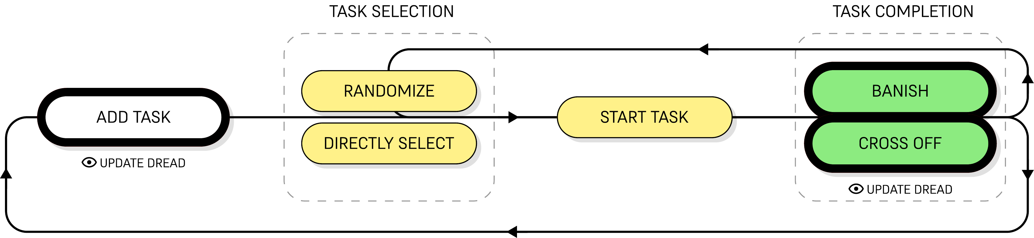
This is a simplified diagram depicting the user flow, where tasks are added, selected, started, completed, and perhaps added again. The dread system updates at two points—increasing on task addition and decreasing upon task completion.
Visual Identity
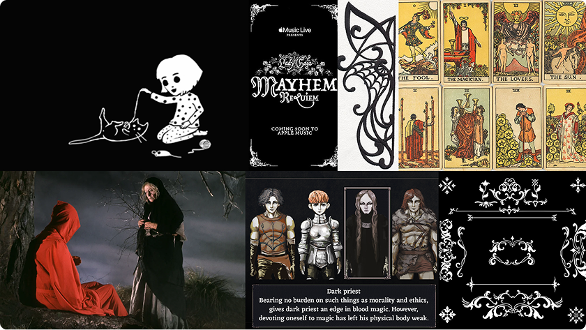
To differentiate my app from similar tools in the market, I immediately wanted to push the video game concept, specifically referencing games in the horror genre (such as Fran Bow and Fear & Hunger). Inspirations included classically gothic, horror-related concepts like tarot, the occult, skulls, and of course, black cats. The focal point was to be a cute yet grotesque cat character, dubbed the titular ‘Skullcat.’
This leans into horror partly because the genre is so consistently reported (if not yet formally studied) as resonating with neurodivergent audiences, who often describe it as a structured, safe way to engage with dread rather than an overwhelming one.
Early Iteration
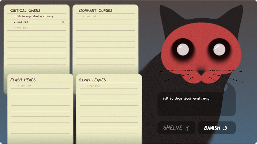
My first draft of the single-screen UI, with a task matrix taking up the majority of the frame to maximize task size and quantity. I used Figma and Affinity to create vector blocks and simple illustrations, but struggled to capture the mood I was initially going for. I succeeded in making an image that was grotesque-cute, but realized that I didn’t value the cuteness factor as much as I had originally thought.
What Worked
✅ Randomizer layout seems intuitive
✅ Task list layout seems intuitive
✅ Skullcat’s position and size looks pretty proportional
What Didn’t
❌ Too many bright colors
❌ Randomizer controls seem too cartoony
❌ Comico font is also too cartoony
❌ Skullcat illustration looks a bit too flat
Final Iteration
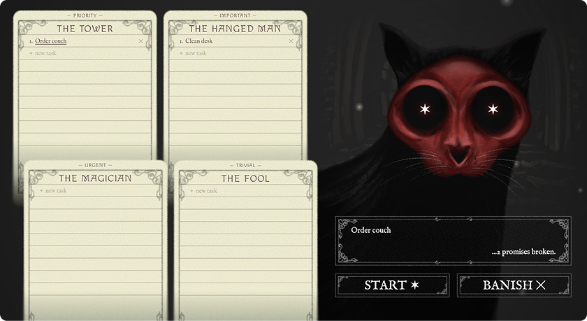
After the initial draft, I swapped from vectors to hand-drawn illustrations and pivoted from the grotesque-yet-cute concept into more classic horror. I pushed the gothic aesthetic by simplifying the randomizer component shapes into rectangles and added flourishes to them, as well as on the task cards. I also changed the font from Comico to Macondo for the card titles and buttons and IM Fell English for the task lists.
To heighten the mystical, occult-inspired elements, I mapped each task card to a major arcana tarot card with a similar meaning:
🗼 Priority > The Tower
🙃 Important > The Hanged Man
🪄 Urgent > The Magician
🃏 Trivial > The Fool.
Motion, Sound & Prototyping
All sounds synthesized live with the Web Audio API, nothing recorded or loaded.
Motion
🌀 Selection whip
Task cards rock during a reading, then snap past center into an overshoot wobble before settling.
🎯 Landing wobble
Picking a task directly, without a reading, still gives it a small kick and the same settle sequence, just gentler, so a direct click has a little life too.
🧙 Passive drift
Cards sway on their own in an occasional wind cycle, the cat breathes with a subtle scale pulse, and small sprites drift upward in the background.
Sound
🔮 Divination drone
A cluster of closely-detuned high tones plus a swirling noise layer, both fed through a long reverb, playing continuously while the board darkens for a reading.
🔨 Selection clang
A metallic hammer-on-anvil hit: a low thump, dissonant ringing partials, a sharp crack, and a bright reverb tail, the instant a task locks in.
💀 Hollow knell
A detuned bell that droops flat, the sound of a rite that can’t proceed, played when banish or divine is pressed with nothing to act on.
⌨ Adding tasks
Each keystroke gets a sharp typewriter clack (duller for backspace), and pressing Enter to commit the task swaps in a small bell ding instead.
🌬️ Ambient noise
A quiet, continuously-drifting wind and air bed runs underneath everything, with occasional soft high “fairy” glints and gust whooshes layered on top at random intervals.
Outcome and Future
The final output is a fully-functional app built and coded in Claude. All functions work as planned, but after further testing by myself and 10 volunteers, two issues stood out.
💀 Too Scary
30% of testers expressed a concern that the visual style may be too scary for a lot of people, preventing potential users from using this tool regularly.
⚡ Occasional Lag
20% of testers found that the task selection process can lag and/or skip frames, especially when pressing ‘stop.’ This may be due to the sheer amount of effects happening on the screen in one instant.
Since the overwhelming majority of testers found the horror visuals fun rather than off-putting, I left the art direction alone. Performance was a different story: I went through a few rounds of revisions trimming back minor effects to cut down on the lag, without touching how the app actually looks.